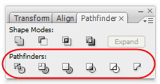
In order to get a better grasp of what each individual tool is doing, let's draw 3 circles as seen below:
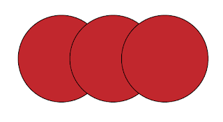 These red filled ellipses will be used to produce more complicated shapes with the help of the Pathfinders. Let's see how.
As it is now we have three circles that overlap one another. There are three distinct paths that define the shape of each circle. Say that we wanted to fill with a yellow collor the area shown below.
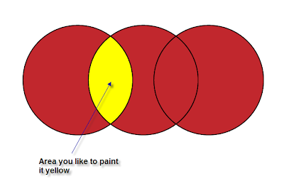 As it is now, this can not be done easilly. Here it's where the 'divide' icon comes in handy.
So select all three circles and press the 'divide' icon.
By doing so what happens is that all the overlapping areas become distinct regions, distinct paths and we can now edit them individually. Before the divide operation there were 3 filled shapes, while after the divide operation there are 5.
Now with the direct selection tool you can do all sort of adjustments to any of the 5 new shapes, you can move, change fill colour, change stroke width etc.
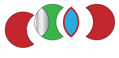 OK... let's go back to the initial 3 circles figure. If we select all three and click on 'trim' icon what happens is that all the overlapping areas of the circles are dissapeared.
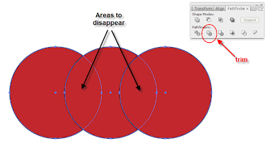 What you'll end up with, is shown in the following image:
 Note
that the stroke of each resulting shape has gone, and keep in mind that
the stacking order of the initial shapes will affect the outcome.
Note
that the stroke of each resulting shape has gone, and keep in mind that
the stacking order of the initial shapes will affect the outcome.Let's move back to our initial 3circle shape, select all three and then click on the 'merge' icon.
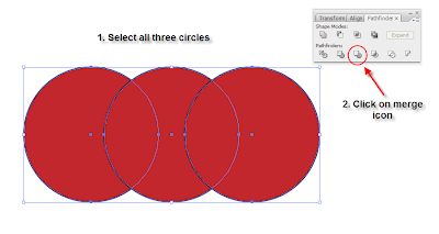 The result would be an addition of all three circles with the stroke removed.
 Let's go back to our initial 3circle shape and add another shape on top. I chose a star.
Select all your shapes and click on the 'crop' icon on the pathfinder panel.
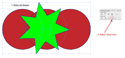 The
result will be everything that lies underneath the star or whatever
shape you have placed on top of the stack. Please note that the stroke
is removed again.
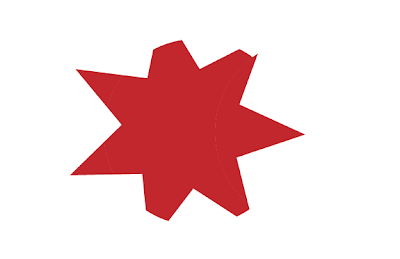 Everything outside the star is removed.
Let's go back to our 3circle shape. Select all three and click on the 'outline' icon.
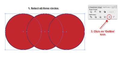 The
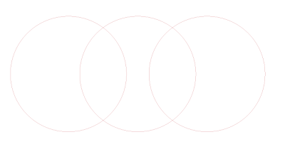
fill colour has been applied to the stroke and all the overlapping
segments of the circle paths have been trimmed. Therefore, you can move
each individual segment and edit it in any way you want.
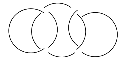
 Try move each segment around and see the result. For clarity I applied a black stroke of 2.
Finally... let's go back to our initial 3circle figure, select the first two circles and click on the 'Minus back' icon.
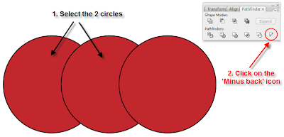 This operation subtracts the back shape from the front one (in the stacking order), and the result can be seen below.
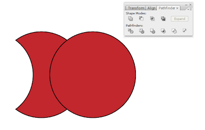 This one acts in the exact opposite way than the 'Subtract from shape area' icon does.


0 comments :
Post a Comment