
Showing posts with label Illustrator. Show all posts
Showing posts with label Illustrator. Show all posts
Tuesday, December 10, 2013

Adobe Illustrator CS3 Tutorial: 'Opacity Masks'
'One of the coolest functions inside
illustrator is the 'Opacity Mask'. Opacity Masks set various
transparency levels in vector Artwork, Text or even photographs.'
1. The Concept
All right then, start Illustrator and Place an image of your like on the artboard.
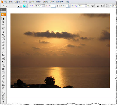
This one is a shot I took during my summer holidays at the end of August... Nice stuff...
Anyway, back to work...Create a shape like the one shown below and place it on top of your photograph.
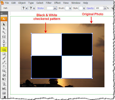
For those wondering how I created this shape, I must say that there are quite a few easy methods to do it. Speaking for myself, I used the Rectangular Grid Tool (highlighted in yellow in the above image).
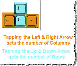
Click and drag on top of the photograph, but before releasing the mouse, press the arrow keys on your keyboard. You will see that tapping the Left & Right keys adjust the number of the columns of your grid, while the Up & Down arrows adjust the number of the rows. This way, I created a 2x2 grid on top of my photograph.
The next step is to break the grid apart so you can fill each box separately. So open the Pathfinder Panel and divide the grid into 4 separate boxes so you can edit each one of them. If you do not know or remember how the Pathfinder works, have a quick look in my Pathfinder panel tutorial. Finally, fill 2 of the boxes with Black. Before you go on, do not forget to group all 4 boxes. Select all 4 and Group them.
As we show in a previous tutorial about Clipping Masks, only that part of the image that lies underneath the path used as a mask will be visible. Opacity Masks on the other hand, reveal what lies underneath them depending on the Luminosity values of the fill of the path that is used as a Mask. This means that depending on how light or dark the mask is, will adjust the visibility of the image below.
So let's see all that in action...
With the Selection Tool (V) select both the checkered pattern and the Photograph beneath it.
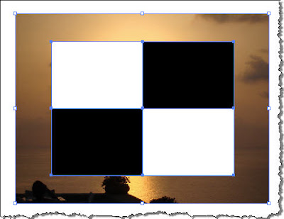
Now you have selected two objects. The photo and the grid. Have a look on the right panel dock, locate the Transparency Panel icon and click to open it. Click on the double arrows to expand the panel and see all available data and settings.
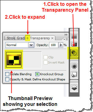
In the panel you can see that there is a thumbnail preview that shows you what your selected objects are. We will explain all this in detail later so for the time being ignore it.
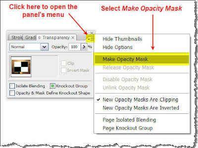
OK, now it's time for the good part. Click on the top right corner of the panel to pop up a flyout menu, and select Make Opacity Mask.
Now check what has happened to your image.
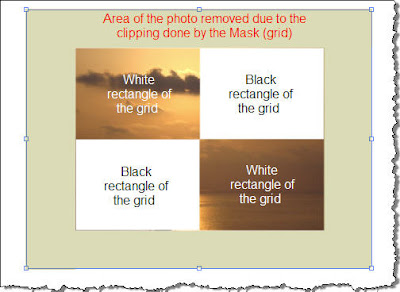
As you see, the Opacity Mask has been succesfully applied and the photograph has been clipped to the outer dimensions of the grid. Since it's all based in Luminosity, and since you can not get any lighter color than White, the parts of the photograph that lie underneath the white areas of the grid will be fully visible (100% opaque - can not see through). On the other hand, areas of the photograph that lie underneath the black rectangles are no longer visible - they have become transparent (0% Opacity - can see through). This means that any object you place behind the photograph will be visible on these areas.
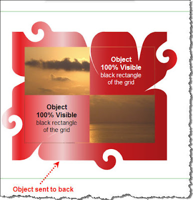
In this example there are two discrete luminous states: 1 White - 2 Black translated in two discrete visibility states of the final image: 1 Opaque - 2 Fully Transparent. The cool thing though about Opacity Masks in Illustrator is that there is no limit to how many luminous levels (steps) you can use in your mask. Check out the following graphic.
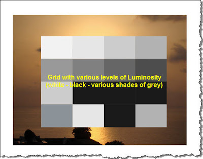 The
black and white grid has been replaced by a grid that contains more
cells each one with a different shade of grey. Repeat the same procedure
like before and apply an Opacity Mask. The result should look like the
following:
The
black and white grid has been replaced by a grid that contains more
cells each one with a different shade of grey. Repeat the same procedure
like before and apply an Opacity Mask. The result should look like the
following:
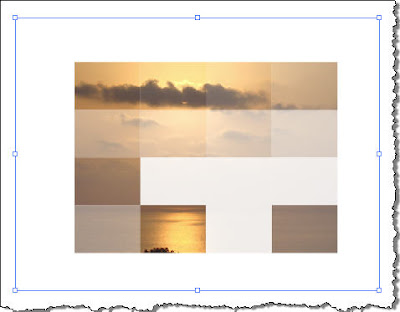
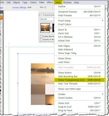
The photograph has been clipped but this time it is not just either OPAQUE or FULLY TRANSPARENT. Since there are rectangle fills with various level of brightness, the result is mixture of areas with different levels of Transparency. Let me show you what I mean. From the menu bar choose VIEW > Show Transparency Grid (Or simply press SHIFT+CTRL+D on your keyboard).
What happens is that your artboard is now filled with a checkered board pattern that helps you see the various levels of transparency applied to your photo depending on the fill of the grid rectangles used as a mask. Actually you now look through the image.
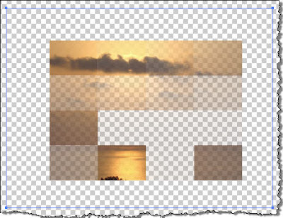
In this case we still have discrete luminsity levels that produce discrete transparency levels of the final impage. I hope that by now you have already guessed where I am getting at.
What if we want a smoother transparency transition to our final image? Let's say we want our image to start from 100% Opaque and gradually smoothly turn to 100% transparent. Then all you have to do is to create a mask on top of your image with a nice black to white (or any other colors actually) Gradient. (Don't ask me about Gradients... go check my post All about Gradients).
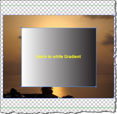
Apply an Opacity Mask and there you go...
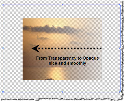
As you see, starting from the black areas of the rectangle the output is fully transparent and as you move towards the left, it gradually and smoothly turns opaque. Cool stuff...
2. The Transparency Panel
Let's spend some time to check the Transparency Panel.
After I have applied the Opacity Mask in my last image the Transparency Panel looked like that:
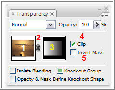
First you notice that there are two thumbnails available (ITEMS 1 & 3), one showing the photograph (ITEM 1) and one showing the mask (ITEM 3) with a lock icon in between (ITEM 2). By default the photo and the mask are locked together and what this does is that if let's say you decide to move the photo, then the mask is moved together. If for some reason you want to move the photograph but you do not want to move the mask (maybe you want to show another part of the photo), then click on the lock icon (it disappears...) and reposition the photo. The mask will stay in place.
If you now click on the Mask Thumbnail (ITEM 3), then you can edit the Gradient the way you would normally do. You may perhaps wanna pick the Gradient tool (like shown in a previous post) and adjust the Gradient like shown below.
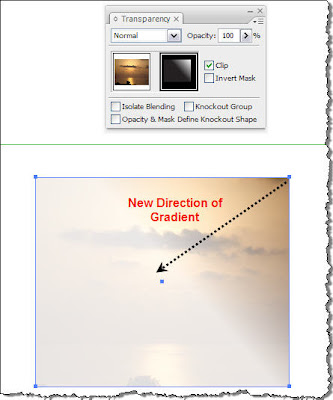 Pay attention when you click on the Mask thumbnail because Illustrator automatically switches to Opacity Mask Mode.
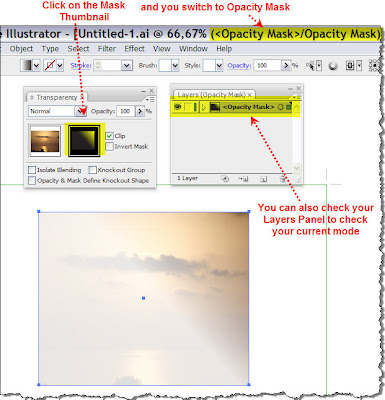
You can always look at Illustrator's title bar or open your Layers Panel (press F7) and check the mode you're working in.
OK... what happens if you uncheck the clip checkbox (ITEM 4)... Actually, the areas of the photograph outside the boundaries of the mask are visible after the Opacity Mask has been applied. It's your call...
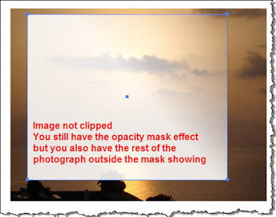 Finally,
clicking in the Invert Mask checkbox does exactly what it says. As we
discussed earlier, when you apply an Opacity Mask, lighter areas of the
Mask cause less transparency on the areas of the object that lies
underneath, while darker colors cause more transparency. If you check
this box, it works the other way round.
Finally,
clicking in the Invert Mask checkbox does exactly what it says. As we
discussed earlier, when you apply an Opacity Mask, lighter areas of the
Mask cause less transparency on the areas of the object that lies
underneath, while darker colors cause more transparency. If you check
this box, it works the other way round.
To give you an example, let's go back to a previous image.
If I click in the checkbox the transparency changes direction. It goes reverse as shown below.
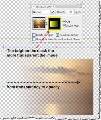
Finally, how can you remove the Opacity Mask? Very simple, just click on the masked artwork and then select Release Opacity Mask from the Transparency panel menu. The masking object reappears on top of the objects that were masked.
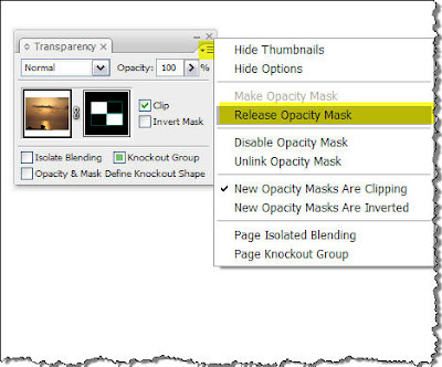
CU and Remember... the sky is the limit...
1. The Concept
All right then, start Illustrator and Place an image of your like on the artboard.

This one is a shot I took during my summer holidays at the end of August... Nice stuff...
Anyway, back to work...Create a shape like the one shown below and place it on top of your photograph.

For those wondering how I created this shape, I must say that there are quite a few easy methods to do it. Speaking for myself, I used the Rectangular Grid Tool
 (highlighted in yellow in the above image).
Click and drag on top of the photograph, but before releasing the mouse, press the arrow keys on your keyboard. You will see that tapping the Left & Right keys adjust the number of the columns of your grid, while the Up & Down arrows adjust the number of the rows. This way, I created a 2x2 grid on top of my photograph.

The next step is to break the grid apart so you can fill each box separately. So open the Pathfinder Panel and divide the grid into 4 separate boxes so you can edit each one of them. If you do not know or remember how the Pathfinder works, have a quick look in my Pathfinder panel tutorial. Finally, fill 2 of the boxes with Black. Before you go on, do not forget to group all 4 boxes. Select all 4 and Group them.
As we show in a previous tutorial about Clipping Masks, only that part of the image that lies underneath the path used as a mask will be visible. Opacity Masks on the other hand, reveal what lies underneath them depending on the Luminosity values of the fill of the path that is used as a Mask. This means that depending on how light or dark the mask is, will adjust the visibility of the image below.
So let's see all that in action...
With the Selection Tool (V)
 select both the checkered pattern and the Photograph beneath it.
Now you have selected two objects. The photo and the grid. Have a look on the right panel dock, locate the Transparency Panel icon
 and click to open it. Click on the double arrows to expand the panel and see all available data and settings.
In the panel you can see that there is a thumbnail preview that shows you what your selected objects are. We will explain all this in detail later so for the time being ignore it.
OK, now it's time for the good part. Click on the top right corner of the panel to pop up a flyout menu, and select Make Opacity Mask.

Now check what has happened to your image.

As you see, the Opacity Mask has been succesfully applied and the photograph has been clipped to the outer dimensions of the grid. Since it's all based in Luminosity, and since you can not get any lighter color than White, the parts of the photograph that lie underneath the white areas of the grid will be fully visible (100% opaque - can not see through). On the other hand, areas of the photograph that lie underneath the black rectangles are no longer visible - they have become transparent (0% Opacity - can see through). This means that any object you place behind the photograph will be visible on these areas.

In this example there are two discrete luminous states: 1 White - 2 Black translated in two discrete visibility states of the final image: 1 Opaque - 2 Fully Transparent. The cool thing though about Opacity Masks in Illustrator is that there is no limit to how many luminous levels (steps) you can use in your mask. Check out the following graphic.
 The
black and white grid has been replaced by a grid that contains more
cells each one with a different shade of grey. Repeat the same procedure
like before and apply an Opacity Mask. The result should look like the
following:
The
black and white grid has been replaced by a grid that contains more
cells each one with a different shade of grey. Repeat the same procedure
like before and apply an Opacity Mask. The result should look like the
following:
The photograph has been clipped but this time it is not just either OPAQUE or FULLY TRANSPARENT. Since there are rectangle fills with various level of brightness, the result is mixture of areas with different levels of Transparency. Let me show you what I mean. From the menu bar choose VIEW > Show Transparency Grid (Or simply press SHIFT+CTRL+D on your keyboard).

What happens is that your artboard is now filled with a checkered board pattern that helps you see the various levels of transparency applied to your photo depending on the fill of the grid rectangles used as a mask. Actually you now look through the image.

In this case we still have discrete luminsity levels that produce discrete transparency levels of the final impage. I hope that by now you have already guessed where I am getting at.
What if we want a smoother transparency transition to our final image? Let's say we want our image to start from 100% Opaque and gradually smoothly turn to 100% transparent. Then all you have to do is to create a mask on top of your image with a nice black to white (or any other colors actually) Gradient. (Don't ask me about Gradients... go check my post All about Gradients).

Apply an Opacity Mask and there you go...

As you see, starting from the black areas of the rectangle the output is fully transparent and as you move towards the left, it gradually and smoothly turns opaque. Cool stuff...
2. The Transparency Panel
Let's spend some time to check the Transparency Panel.
After I have applied the Opacity Mask in my last image the Transparency Panel looked like that:

First you notice that there are two thumbnails available (ITEMS 1 & 3), one showing the photograph (ITEM 1) and one showing the mask (ITEM 3) with a lock icon in between (ITEM 2). By default the photo and the mask are locked together and what this does is that if let's say you decide to move the photo, then the mask is moved together. If for some reason you want to move the photograph but you do not want to move the mask (maybe you want to show another part of the photo), then click on the lock icon (it disappears...) and reposition the photo. The mask will stay in place.
If you now click on the Mask Thumbnail (ITEM 3), then you can edit the Gradient the way you would normally do. You may perhaps wanna pick the Gradient tool
 (like shown in a previous post) and adjust the Gradient like shown below.
 Pay attention when you click on the Mask thumbnail because Illustrator automatically switches to Opacity Mask Mode.
You can always look at Illustrator's title bar or open your Layers Panel (press F7) and check the mode you're working in.
OK... what happens if you uncheck the clip checkbox (ITEM 4)... Actually, the areas of the photograph outside the boundaries of the mask are visible after the Opacity Mask has been applied. It's your call...
 Finally,
clicking in the Invert Mask checkbox does exactly what it says. As we
discussed earlier, when you apply an Opacity Mask, lighter areas of the
Mask cause less transparency on the areas of the object that lies
underneath, while darker colors cause more transparency. If you check
this box, it works the other way round.
Finally,
clicking in the Invert Mask checkbox does exactly what it says. As we
discussed earlier, when you apply an Opacity Mask, lighter areas of the
Mask cause less transparency on the areas of the object that lies
underneath, while darker colors cause more transparency. If you check
this box, it works the other way round.To give you an example, let's go back to a previous image.
If I click in the checkbox the transparency changes direction. It goes reverse as shown below.

Finally, how can you remove the Opacity Mask? Very simple, just click on the masked artwork and then select Release Opacity Mask from the Transparency panel menu. The masking object reappears on top of the objects that were masked.

CU and Remember... the sky is the limit...
Adobe Illustrator CS3 Tutorial: 'Everything about Gradients
'After discussing about Clipping Masks in a previous post, my intention was to start a subject about Opacity Masks,
but then, I thought it would be a better idea to talk about Gradients
as an introduction to Opacity Masks. I think it's useful anyway...'
A nice Gradient Fill can really make the difference and enhance your artwork. I will try to explain in detail all about Gradients.
An alternative way of coloring an object with a solid fill, is choosing a gradient. A gradient fill consists of more than a single color. It takes a minimum of two colors gradually blending from one to the other.
Ok, let's see all that in action.
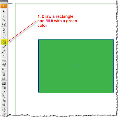
So, start Illustrator and create a new document. In the toolbox on the left, select the Rectangle tool , click on the artboard and drag to draw a rectangle with a black stroke and a nice solid green color.
 From the right dock, click on the Gradient Panel
  and click to expand it.
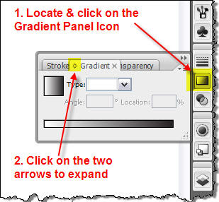 Of course, you can always avoid all this by simply clicking CTRL+F9 on your keyboard.
With the rectangle still selected, click on the small icon on the top left corner of the panel in order to change from the solid green color to a gradient fill. This is the Gradient Fill Box, and displays the current gradient colors and type. By default, the panel includes a start and end color box. Notice that the first time you will click on this icon, the default white to black gradient fill will be applied to your selection.
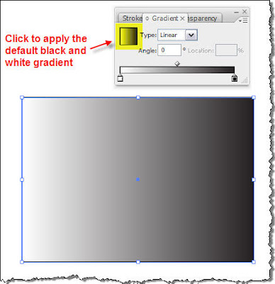 As
you see, the rectangle fill, looking at it from left to right, starts
from pure white color and then it gradually blends into shades of grey
until it ends up to pitch black. Why is this happening?
As
you see, the rectangle fill, looking at it from left to right, starts
from pure white color and then it gradually blends into shades of grey
until it ends up to pitch black. Why is this happening?
Take a look at the Gradient Panel.
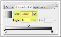
Let's focus first on the Type textbox and the Angle textbox. There are two types of Gradients, Linear and Radial. Below I will try to explain the difference between them.
a. Linear Gradient
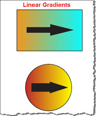
In a linear gradient the blending of one color to the other takes place along a straight line from one side of the object to the other. In the following images the blending starts from left to right along a straight line.
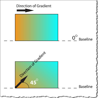
In this type of gradient, you may also specify the angle of that line, the direction along which the color blending will take place. In the images shown above, the angle is 0 degrees. If you input a value of 45 degrees the result is shown below.
b. Radial Gradient
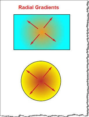
In a Radial Gradient, color blending starts from the center of the shape and is completed outwards.
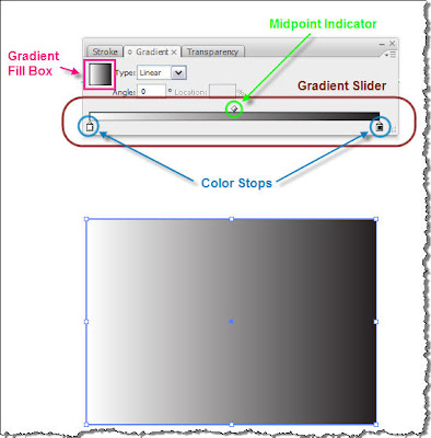
Ok, let's go back to the rectangle we started with, so that we explore the Gradient Panel a bit more. At the bottom of the panel, there is a tool called the Gradient Slider. The Gradient Slider adjusts the way the Gradient looks. Underneath the slider bar, you can see two small 'pointers' called Color Stops (the start color and the end color of the Gradient). On the top side of the bar, there is a diamond shaped icon called the Midpoint Indicator. This is an indication of where is the midpoint of the transition from one color to the other.
For demonstration reasons, I undocked the panel and resized it so that its length is equal to my rectangle length.
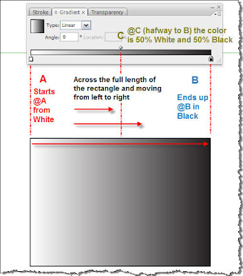
Ok now, let's see what adjustments we can make to our dull rectangle. Click on the Midpoint Indicator and drag towards the right. You will see that your gradient is adjusted so that the midpoint will be at the new point you defined. You will also notice that as soon as you move the Indicator the Location value box becomes active so that you can precisely place the Midpoint along the Gradient.
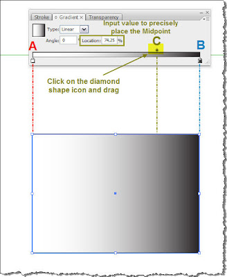
Let's see now what happens if we move the Color Stops. Make sure the rectangle is selected, and let's assume we move the white stop towards the right at approximately 20% (shown in the Location box) of the Gradient slider length and the black stop at the 80%. You should have an image similar to the following.

What has actually happened is that the rectangle is now split in 3 zones. In Zone 1, we have solid white color. Then, at 20% of the rectangle length (at point A) is where our gradient starts. It starts from pure white, lasts throughout Zone 2 (it also passes from midpoint at C) and the blending is completed by turning into black at point B (approximately @80%). From this point onwards, we have Zone 3 in which we have pure solid Black color.
Remember we talked earlier about Linear Gradients and how we can adjust the direction of the Gradient by entering an angle in the Angle text box? In order to avoid the fuzz of manually inputing the angles you can simply select the Gradient tool from the left toolbar, and drag accordingly in the document window to set the angle. This is an example of how you do it.
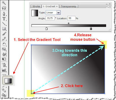 In
the previous image, what I actually did by clicking and dragging (on
the yellow highlighted spots), was to specify an angle of approx. 34
degrees.
In
the previous image, what I actually did by clicking and dragging (on
the yellow highlighted spots), was to specify an angle of approx. 34
degrees.
Let's see now what happens if you select the Gradient Tool again, but this time you click outside the shape,drag and release the mouse again outside the rectangle.
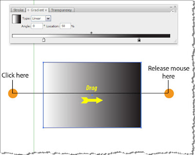
In order to fully understand what happens, take a look at the previous image. Given that you clicked on the amber spots, I resized the Gradient Slider to extend from the start point to the end point of the Gradient. The solid white and the solid black regions of my gradient are outside the rectangle, thus not visible. In general, with the gradient tool you can very quickly test many angles to your gradients and choose the best one for your design.
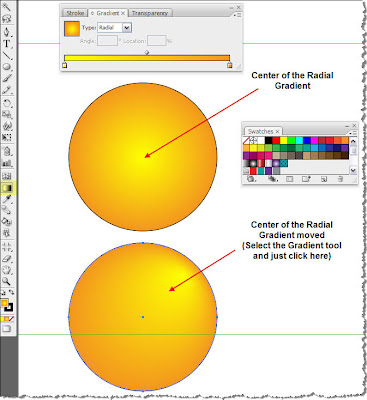
If you are dealing with a radial gradient and you decide to modify it with the gradient tool, then the place you click and start your drag is the center of the gradient. Have a look at the following image.
Let's say we agreed on the direction of the Gradient but we are not satisfied with the boring colors of our gradient so we want to spice things up a bit. What about playing around with the colors?
There are quite a few ways to change the colors of a gradient. A quick one is described below. Open the Swatches Panel. Locate it on the right dock and click on it (or use the top Menu and choose Window > Swatches).
Select the rectangle with the white to black Gradient. Click on a color swatch of your like and drag it on top of one of the color stops, let's say the white.
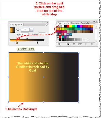
You could do the same procedure for replacing the black color stop, but I want to show you a different way to change the color. So click on the black color Stop. On the right dock locate and click to open the Color Panel (or simply press F6) . By doing so, you see that the color is solid black. Press SHIFT and click on the ramp at the bottom of the color panel.
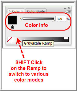
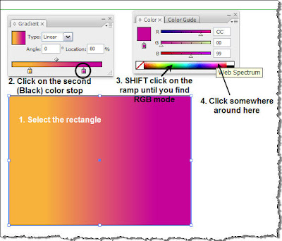
This way you' re switching between the available color modes, RGB, CMYK etc. Set it to RGB and pick a color over the right edge of the bar. The result should be something similar to the following.
Of course gradients are not limited just to two colors. You can create gradients consisting of many colors. And it's very easy to do it. Repeat the same procedure like before, but this time drop the color on the slider somewhere between the two initial color stops. The result should be similar to the following image.
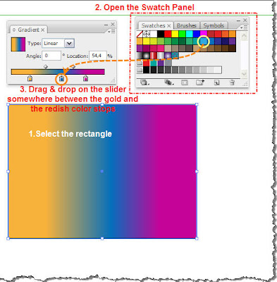 As
you notice, by adding a new color stop, a Midpoint indicator is also
created. So you can precisely adjust the midpoint for every section of
the gradient separately (one midpoint indicator for each pair of color
stops). You may add as many color stops as you may handle and produce
impressive gradients. Try adding a 4th and a 5th color stop to the
gradient.
As
you notice, by adding a new color stop, a Midpoint indicator is also
created. So you can precisely adjust the midpoint for every section of
the gradient separately (one midpoint indicator for each pair of color
stops). You may add as many color stops as you may handle and produce
impressive gradients. Try adding a 4th and a 5th color stop to the
gradient.
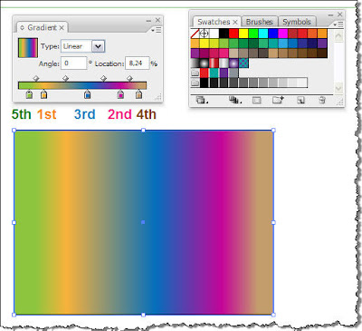
Let's say now that we are happy with all these colors and satisfied with the gradient fill we created for our rectangle. Illustrator offers you the ability to save this gradient's settings and store them as a new color swatch in the Swatches Panel and use it again in the future. Let me show you how.
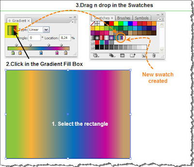
Click in the Gradient Fill box, drag n' drop in the Swatches Panel and there you go... Your gradient swatch is now available for later reference. Double-click on the swatch icon and in the pop-up window give it a name of your like. I named it 'Rainbow'.
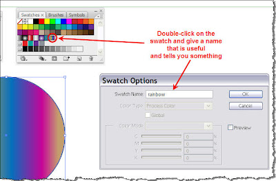
So if you now create a new rectangle or circle, select it and just click on the newly created swatch (rainbow) in the Swatches Panel.
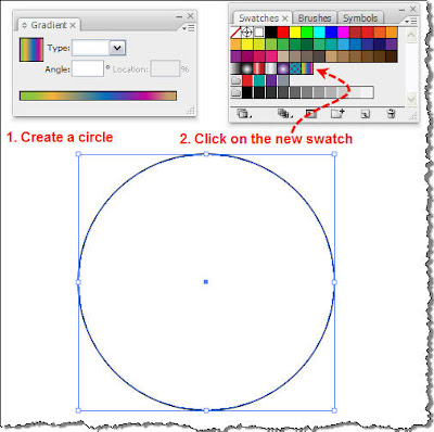
The result is a circle with the gradient fill you created before but you do not have to go through all the procedure of creating the gradient from the very beginning.
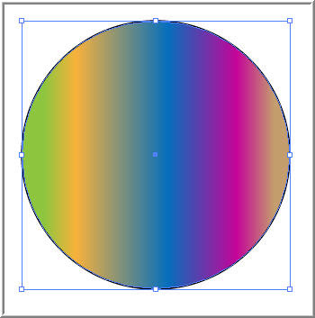 In just a snap...
Before you go, check out other interesting tutorials of mine:
A nice Gradient Fill can really make the difference and enhance your artwork. I will try to explain in detail all about Gradients.
An alternative way of coloring an object with a solid fill, is choosing a gradient. A gradient fill consists of more than a single color. It takes a minimum of two colors gradually blending from one to the other.
Ok, let's see all that in action.
So, start Illustrator and create a new document. In the toolbox on the left, select the Rectangle tool
 , click on the artboard and drag to draw a rectangle with a black stroke and a nice solid green color.
 From the right dock, click on the Gradient Panel
  and click to expand it.
 Of course, you can always avoid all this by simply clicking CTRL+F9 on your keyboard.
With the rectangle still selected, click on the small icon on the top left corner of the panel in order to change from the solid green color to a gradient fill. This is the Gradient Fill Box, and displays the current gradient colors and type. By default, the panel includes a start and end color box. Notice that the first time you will click on this icon, the default white to black gradient fill will be applied to your selection.
 As
you see, the rectangle fill, looking at it from left to right, starts
from pure white color and then it gradually blends into shades of grey
until it ends up to pitch black. Why is this happening?
As
you see, the rectangle fill, looking at it from left to right, starts
from pure white color and then it gradually blends into shades of grey
until it ends up to pitch black. Why is this happening?Take a look at the Gradient Panel.

Let's focus first on the Type textbox and the Angle textbox. There are two types of Gradients, Linear and Radial. Below I will try to explain the difference between them.
a. Linear Gradient
In a linear gradient the blending of one color to the other takes place along a straight line from one side of the object to the other. In the following images the blending starts from left to right along a straight line.

In this type of gradient, you may also specify the angle of that line, the direction along which the color blending will take place. In the images shown above, the angle is 0 degrees. If you input a value of 45 degrees the result is shown below.

b. Radial Gradient
In a Radial Gradient, color blending starts from the center of the shape and is completed outwards.

Ok, let's go back to the rectangle we started with, so that we explore the Gradient Panel a bit more. At the bottom of the panel, there is a tool called the Gradient Slider. The Gradient Slider adjusts the way the Gradient looks. Underneath the slider bar, you can see two small 'pointers' called Color Stops (the start color and the end color of the Gradient). On the top side of the bar, there is a diamond shaped icon called the Midpoint Indicator. This is an indication of where is the midpoint of the transition from one color to the other.

For demonstration reasons, I undocked the panel and resized it so that its length is equal to my rectangle length.

Ok now, let's see what adjustments we can make to our dull rectangle. Click on the Midpoint Indicator and drag towards the right. You will see that your gradient is adjusted so that the midpoint will be at the new point you defined. You will also notice that as soon as you move the Indicator the Location value box becomes active so that you can precisely place the Midpoint along the Gradient.

Let's see now what happens if we move the Color Stops. Make sure the rectangle is selected, and let's assume we move the white stop towards the right at approximately 20% (shown in the Location box) of the Gradient slider length and the black stop at the 80%. You should have an image similar to the following.

What has actually happened is that the rectangle is now split in 3 zones. In Zone 1, we have solid white color. Then, at 20% of the rectangle length (at point A) is where our gradient starts. It starts from pure white, lasts throughout Zone 2 (it also passes from midpoint at C) and the blending is completed by turning into black at point B (approximately @80%). From this point onwards, we have Zone 3 in which we have pure solid Black color.
Remember we talked earlier about Linear Gradients and how we can adjust the direction of the Gradient by entering an angle in the Angle text box? In order to avoid the fuzz of manually inputing the angles you can simply select the Gradient tool
from the left toolbar, and drag accordingly in the document window to set the angle. This is an example of how you do it. In
the previous image, what I actually did by clicking and dragging (on
the yellow highlighted spots), was to specify an angle of approx. 34
degrees.
In
the previous image, what I actually did by clicking and dragging (on
the yellow highlighted spots), was to specify an angle of approx. 34
degrees.Let's see now what happens if you select the Gradient Tool again, but this time you click outside the shape,drag and release the mouse again outside the rectangle.

In order to fully understand what happens, take a look at the previous image. Given that you clicked on the amber spots, I resized the Gradient Slider to extend from the start point to the end point of the Gradient. The solid white and the solid black regions of my gradient are outside the rectangle, thus not visible. In general, with the gradient tool you can very quickly test many angles to your gradients and choose the best one for your design.
If you are dealing with a radial gradient and you decide to modify it with the gradient tool, then the place you click and start your drag is the center of the gradient. Have a look at the following image.

Let's say we agreed on the direction of the Gradient but we are not satisfied with the boring colors of our gradient so we want to spice things up a bit. What about playing around with the colors?
There are quite a few ways to change the colors of a gradient. A quick one is described below. Open the Swatches Panel. Locate it on the right dock and click on it
 (or use the top Menu and choose Window > Swatches).
Select the rectangle with the white to black Gradient. Click on a color swatch of your like and drag it on top of one of the color stops, let's say the white.

You could do the same procedure for replacing the black color stop, but I want to show you a different way to change the color. So click on the black color Stop. On the right dock locate and click to open the Color Panel (or simply press F6)
 . By doing so, you see that the color is solid black. Press SHIFT and click on the ramp at the bottom of the color panel.
This way you' re switching between the available color modes, RGB, CMYK etc. Set it to RGB and pick a color over the right edge of the bar. The result should be something similar to the following.

Of course gradients are not limited just to two colors. You can create gradients consisting of many colors. And it's very easy to do it. Repeat the same procedure like before, but this time drop the color on the slider somewhere between the two initial color stops. The result should be similar to the following image.
 As
you notice, by adding a new color stop, a Midpoint indicator is also
created. So you can precisely adjust the midpoint for every section of
the gradient separately (one midpoint indicator for each pair of color
stops). You may add as many color stops as you may handle and produce
impressive gradients. Try adding a 4th and a 5th color stop to the
gradient.
As
you notice, by adding a new color stop, a Midpoint indicator is also
created. So you can precisely adjust the midpoint for every section of
the gradient separately (one midpoint indicator for each pair of color
stops). You may add as many color stops as you may handle and produce
impressive gradients. Try adding a 4th and a 5th color stop to the
gradient.
Let's say now that we are happy with all these colors and satisfied with the gradient fill we created for our rectangle. Illustrator offers you the ability to save this gradient's settings and store them as a new color swatch in the Swatches Panel and use it again in the future. Let me show you how.

Click in the Gradient Fill box, drag n' drop in the Swatches Panel and there you go... Your gradient swatch is now available for later reference. Double-click on the swatch icon and in the pop-up window give it a name of your like. I named it 'Rainbow'.

So if you now create a new rectangle or circle, select it and just click on the newly created swatch (rainbow) in the Swatches Panel.

The result is a circle with the gradient fill you created before but you do not have to go through all the procedure of creating the gradient from the very beginning.
 In just a snap...
Before you go, check out other interesting tutorials of mine:


